

I refuse to believe album art is dead.
Sure, the album's reign may have given way to streaming platforms and the increasingly problematic playlist, but album (or, more commonly, single) artwork still plays a huge role in how we interpret the music we're listening to, whether it is on our iPhone screens or a now-permanent part of the internet lexicon. How else do you explain Nicki Minaj's "Anaconda" artwork generating so much buzz a few years ago? Celebrities showing skin is nothing new, but as soon as Minaj attached her bare behind to a single release, it became a capital-s statement.
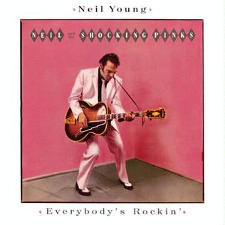
Good album artwork can craft a mood, inform the musical style, be provocative or simply look damn cool. And I would even argue that "bad" album artwork—art that is tacky, poorly designed or unpleasant to look at—can at times add something to the auditory substance of the record. Neil Young's Everybody's Rockin' cover exposes Young's playful take on rockabilly, letting listeners know what they're getting into before they press play. Kanye West's The Life of Pablo has (rightfully) earned plenty of "graphic design is my passion" quips, but it's hard to imagine a cover more fitting for an all-over-the-place album, one that was obsessively tweaked and fussed over (to its detriment, some would argue) by West in the months following its release.
On a more visceral level, bad album art can just be hilarious. I have never listened to Ken's By Request Only, but I am so, so thankful that its cover exists.
I can't say the same for LCD Soundsystem's American Dream cover art, which dropped early Friday.

I don't know what to make of this image, other than that it's awful. In fact, I would go so far as to call it unsettling. If it was just a stock photo of a daytime sky, à la Windows's default wallpaper or a Sims game, that would be one thing. But there's something about that particular shade of blue—GoGurt blue, dare I call it—and uninspired font layered on top that plunges this artwork into the depths of the Uncanny Valley.
It looks like a photo taken above the Teletubbies TV set while the Teletubbies were doing terrible, unspeakable things just below the frame. It looks like the bright suburban sky in the "Black Hole Sun" video before the scene transforms into a Wes Craven-directed American Beauty. It's the album artwork your favorite Christian pop-punk band releases when it decides to both sell out and go full-on evangelical.
The more you look at the center point of the image—the cheery summer sun—the more it begins to look like a spotlight with the same ominous aura as the monolith from 2001: A Space Odyssey. It becomes impossible to ignore the clouds around the image's perimeter bending toward the middle, as though the sun itself is a shiny black hole. This cover isn't just bad, it's uncomfortable.
Is that intentional? Possibly: The record's title track definitely points to a certain American brand of anxiety and unease (topical!), with its eerie synth line and talk of acid trips gone wrong. But this isn't especially new territory for the band, and it hasn't stopped it from making simple yet fantastic album art in the past.
Whatever James Murphy & Co.'s intentions behind the cover, Twitter responded as it is wont to do following this sort of announcement—with comparison-laden jokes.
Kasabian: we got the worst album cover of the year on lock
— Alex V (@flexvangundy) August 4, 2017
LCD Soundsystem: hold my drink
🤢🤢🤢 pic.twitter.com/WZXgzmr0fI
folks,, we gotta talk about this insane lcd soundsystem cover pic.twitter.com/GiVbuu8nFy
— obi-want some toppin (@OfficialBrohoss) August 4, 2017
I actually thought the new LCD Soundsystem album cover was a Scientology recruitment poster when I first saw it.
— Ronak Nair (@RonakNair) August 4, 2017
This is.... disappointing pic.twitter.com/ehr5hONxqi
LCD Soundsystem's new album cover looks like it belongs in @ graphic design is my passion pic.twitter.com/Fl48xRD3sd
— tiff (@suburbanennui_) August 4, 2017
looks like lcd soundsystem wanted to give MS Paint a proper sendoff with their new album cover pic.twitter.com/3Wn2O1s87d
— 𝗵𝗲𝗮𝘁𝗵 (@heathdwilliams) August 4, 2017
Sidenote: In April, Twitter user @slumlord1991 suggested a potential American Dream cover, below. It is quite good and not terrible.
Uncommon Knowledge
Newsweek is committed to challenging conventional wisdom and finding connections in the search for common ground.
Newsweek is committed to challenging conventional wisdom and finding connections in the search for common ground.
About the writer
To read how Newsweek uses AI as a newsroom tool, Click here.


