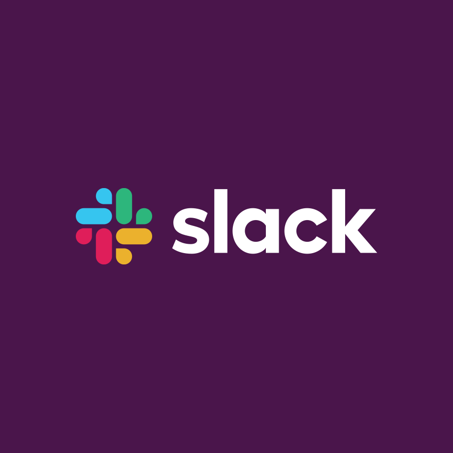
When Slack enthusiastically unveiled its new logo, users of the popular workplace messaging tool were less than complimentary, with some even comparing it to the Nazi swastika.
In a blog post on its website, Slack explained that its old logo—an 11-color hash titled to an angle—was complicated and had too many variations, diluting the company's brand identity.
Slack wrote that its old logo was "extremely easy to get wrong" because of its colors and angle. The new logo only has four colors and no tilt.
"Today we're launching a new logo, as we start to refresh our look in general. We loved our old logo, and look, and know many felt the same," the post said.
"And yet, here we are to explain why we decided to evolve it...it's not change for the sake of change. That said, change is inevitable, and something to be embraced, etc. etc., but that's not a good enough reason to change a logo.
"A good reason to change a logo is that it's not doing the job you want it to do—and because a simpler, more distinctive evolution of it could do that job better."
After posting the news of its logo revamp to Twitter, Slack users descended in their droves.
"Are you a sprinkler company now?" asked the Twitter user @codersplzaccept, referring to the four elements of the new logo that are speech bubbles but also look like droplets of water.
The redesign was carried out by the design studio Pentagram, who wrote on their website that "the team decided to retain the equity of Slack's familiar octothorpe, retooling it to eliminate reproduction challenges and increase consistency across applications."
When Slack linked to Pentagram's website, Twitter user @vmarks wrote: "You mean to say you paid for the colorful swastika? You should both be embarrassed."
Ta-da! From today, Slack has a new logo, the start of a general refresh of our look. A little simpler, a little clearer, and (we think) a little better. Read more about this change in the handy blog post we’ve written about it: https://t.co/LT1ju7kGxw pic.twitter.com/aceZMCb5St
— Slack (@SlackHQ) January 16, 2019
— Tadas Labudis (@tadaslab) January 16, 2019
... pic.twitter.com/cQAOH37RE7
— Christian Dakota (@codydohertyy) January 16, 2019
Fewer colors, to start with! Also, our friends at @pentagram have great notes here if you're interested: https://t.co/iyss2PwyVJ
— Slack (@SlackHQ) January 16, 2019
You mean to say you paid for the colorful swastika? You should both be embarrassed
— victor marks (@vmarks) January 16, 2019
Oh, Slack. 🤦🏻♂️ Everyone knows that you have to be careful to avoid swastikas when doing a 4-element pinwheel logo, but there’s one right there in the negative space! How was this one even proposed with a straight face?? 😩
— Twits McGee (@endtv) January 16, 2019
I love you @SlackHQ but swastika was the first thing I saw and I can not unsee it.
— J Strothman (@juliestrothman) January 16, 2019
swastika
— Ryan Huggins (@TheRyanHuggins) January 17, 2019
— the moon isn't real (@hawver) January 16, 2019
— Mig (@migbrieva) January 16, 2019
Uhh google photos? pic.twitter.com/yjnwzxeGIm
— Ian Gabriel (@IGabrielSanchez) January 16, 2019
— Claire (@clairesh_) January 16, 2019
This one https://t.co/sY2eTRi3Dr pic.twitter.com/iQrgfnyqIp
— Daniel Ramirez (@drmzio) January 16, 2019
— Curt Janka 🐻 (@curtjanka) January 17, 2019
Can you gonna upgrade those as well pic.twitter.com/IsFwmCkRsM
— Léo 🌲 (@sinequanonh) January 16, 2019
FACT CHECK: Your post asserts that the old logo used 11 colors, but eyedropper reports only *8* colors (10 if we count background and wordmark text) — WHAT IS THE TRUTH?
— Anil Dash 🗳 Election is the start, not the end 📢 (@anildash) January 16, 2019
Missing the 18º tilt :/ feels static.. not... slack anymore? pic.twitter.com/s1xUBwUaTr
— Lucas Petes ✊🇧🇷🇩🇪 (@lucaspetes) January 16, 2019
Leadership at Slack: Always remember that you can reverse course on any decision. Sticking to a bad decision for no better reason than a gut-level aversion to fleeting shame is no reason to stick with a bad call. This was a bad call.
— Matthew Hales ⚜️ (@VivaNOLA) January 16, 2019
Is there something you'd like to tell us? pic.twitter.com/BieSuMRpCK
— OppenheimersToy (@OppenheimersToy) January 16, 2019
The power of custom icons on Android pic.twitter.com/IwGcaOTsSO
— SomewhatNotHere (@Somewhat8) January 17, 2019
Internet hugs 🤗 for ya @SlackHQ
— SimplePlan (@simpleplanmedia) January 17, 2019
Must be a hard day at work when the whole internet is like: pic.twitter.com/aLlSj4BMRI
— Trizephyr (@trizephyr) January 16, 2019
Seems like you took the guys from pentagram as a hostages and tortured them until they promised to make the most awful icon redesign pentagram ever made.
— This is sbkwsk (@sbkwsk) January 16, 2019
— Alexander Krstović (@Alexkrstovic) January 16, 2019
"Derived from the original logo and built on a grid, the new octothorpe is comprised of two basic geometric shapes––a speech bubble and lozenge––that can be extracted and used as graphic elements," Pentagram wrote about the project.
"The speech bubble evokes communication and connectivity, and will form the basis of a system of customized icons, illustrations and motifs with rounded corners that echo the shapes of the logo. The new octothorpe can scale up or down to optimize legibility at various sizes.
"The updated palette features four primary colors, more manageable than the original's eleven, which suffered against any background color other than white. These have been optimized to look better on screen, and the identity also retains Slack's distinctive aubergine purple as an accent color.
"Used in the platform's main communication channel, the color makes Slack instantly recognizable against the white of other desktop windows."
Not everyone hated the design though.
I like 👍🏻 give the design team who did this a raise and a high five ☺️
— Daniel Yount (@dyountmusic) January 16, 2019
People who say the new logo is bad don’t understand many design principles. The old logo ran into color mixing issues due to transparency and when people say “its not more simple†well yes it is because the old logo had overlapping etc while the new one is separated and distinct.
— Jay (@TheDesignerJay) January 17, 2019
Woah woah woah. You can’t mean to tell met that armchair-designer twitter has a worse grasp on design/brand than experts in the field??
— Daniel Yount (@dyountmusic) January 17, 2019
/s
Uncommon Knowledge
Newsweek is committed to challenging conventional wisdom and finding connections in the search for common ground.
Newsweek is committed to challenging conventional wisdom and finding connections in the search for common ground.
About the writer
Shane Croucher is a Senior Editor based in London, UK. He oversees the My Turn team. He has previously overseen ... Read more
To read how Newsweek uses AI as a newsroom tool, Click here.

