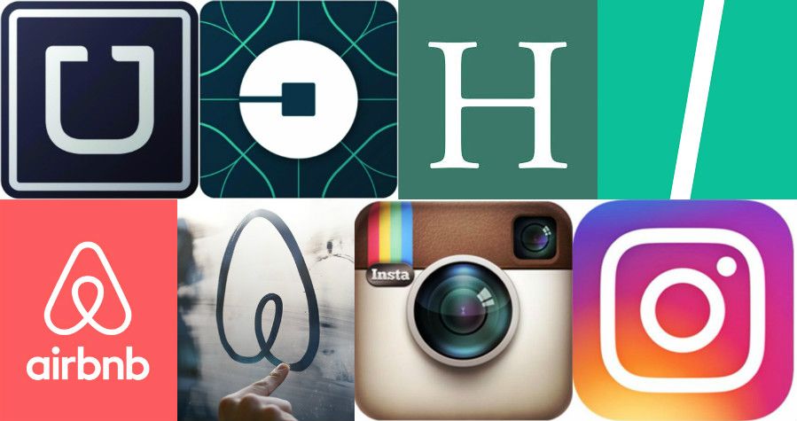
The Huffington Post on Tuesday unveiled a redesigned website. The redesign included a new logo. The logo is a box with a line through it.
What's more annoying than the logo is the way the Huffington Post—or HuffPost, as it's now called—explained the decision to rebrand. It managed to fulfill nearly every trope we've seen from self-important companies that have tweaked their images in recent years. It blogged about the rebranding. It posted a picture of a vision board of drafts of the logo. It noted how the new logo embodied how the company does things differently, while at the same time paying homage to its past. Here's an excerpt:
We landed on this final version because we love what happens when the two shapes join together as the new icon for our apps and social channels. The mark itself forms a road, a slash, an abstract H ― everyone sees something different, and we embrace all the possibilities. We've also updated our signature green, the color audiences associate with HuffPost, and brightened it for this new era.
Once again, the logo is a box with a line through it.
In honor of this pile of nonsense, we decided to examine how Silicon Valley—the world's most fertile repository of self-important jargon—and others have stretched the bounds of what it means to be annoying through how rebrands and/or logo redesigns are rolled out.
Related: Widow of Uber engineer who took his own life blames job stress
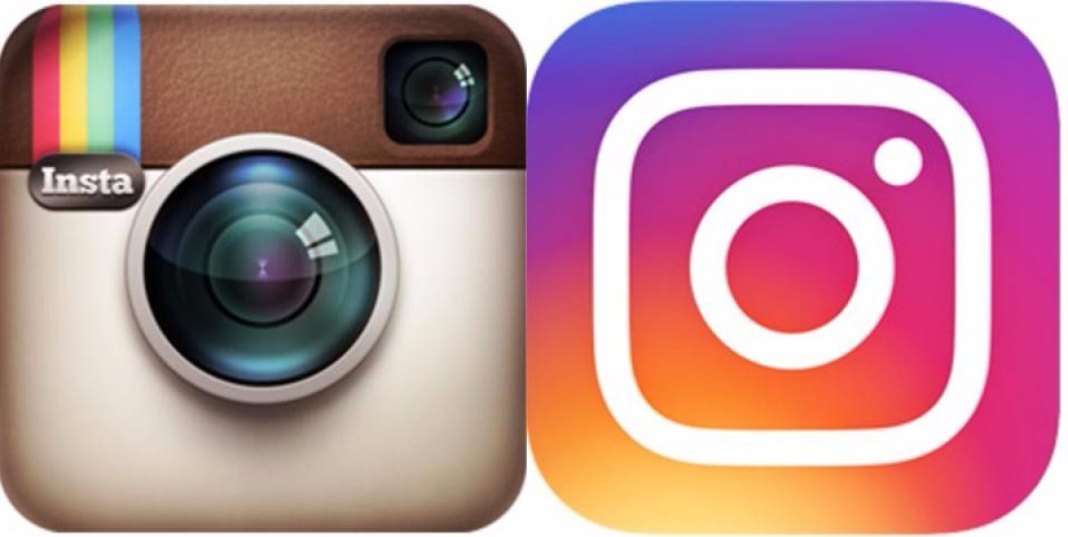
Instagram's rebrand in May 2016 drew an exceptional amount of criticism from users, primarily because of the weird purple-to-orange gradient splashed across a new minimalist logo.
The photo-sharing app also put an exceptional amount of time and effort into its rollout video.
This is cute enough, but here's how it explained the change:
The Instagram community has evolved over the past five years from a place to share filtered photos to so much more — a global community of interests sharing more than 80 million photos and videos every day. Our updated look reflects how vibrant and diverse your storytelling has become.
Does it really?
Though Twitter played it safe with the rebrand rollout video—only 17 seconds, no voiceover, no superimposed text—it also, as is customary, released a really annoying blog post about it.
Our new bird grows out of love for ornithology, design within creative constraints, and simple geometry. This bird is crafted purely from three sets of overlapping circles — similar to how your networks, interests and ideas connect and intersect with peers and friends. Whether soaring high above the earth to take in a broad view, or flocking with other birds to achieve a common purpose, a bird in flight is the ultimate representation of freedom, hope and limitless possibility.
Yes, the three sets of overlapping circles represent the intersection of networks, interests and ideas. Sure.
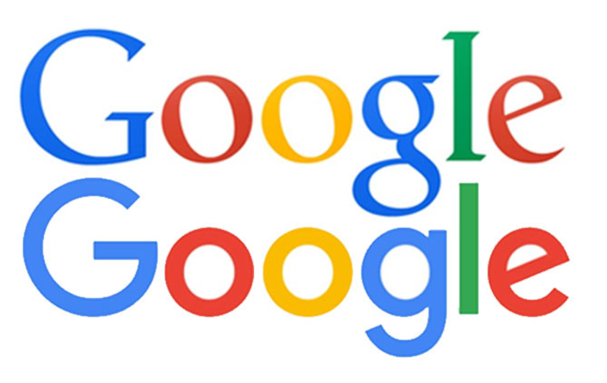
Google explained its September 2015 redesign with a blog post titled "Evolving the Google Identity." Unlike many of the entries on this list, Google was more or less able to restrain itself from incorporating a bunch of abstract changing-the-world-rhetoric, instead opting for a more design-focused overview. This isn't to say it wasn't worthy of a few eye rolls. Some highlights from post (emphasis ours):
- "Users now engage with Google using a constellation of devices."
- "A refinement of what makes us Googley..."
- "The Google logo has always had a simple, friendly, and approachable style. We wanted to retain these qualities by combining the mathematical purity of geometric forms with the childlike simplicity of schoolbook letter printing."
- "The Google dots are a dynamic and perpetually moving state of the logo. They represent Google's intelligence at work and indicate when Google is working for you. We consider these unique, magic moments."
- "Our new logotype is set in a custom, geometric sans-serif typeface and maintains the multi-colored playfulness and rotated 'e' of our previous mark—a reminder that we'll always be a bit unconventional."
TRONC
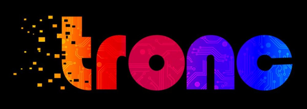
The boldest (and worst) rebrand of recent memory came in June 2016, when Tribune Publishing, which owns outlets like the Los Angeles Times and the Chicago Tribune, changed its name to Tronc. The company justified it with a remarkable amount of jargon, graphics and creepy enthusiasm. This is the corporate profile:
tronc, Inc. (NASDAQ: TRNC) is a media company rooted in award-winning journalism, which harnesses proprietary technology to present personalized, premium content to a global audience in real time. tronc draws content from its vast media portfolio, where a commitment to informing and inspiring communities has earned 92 Pulitzer Prizes and a monthly audience of 65 million. From pixels to Pulitzers, tronc brands optimize content and create engaging experiences for audiences across all channels.
Put simply, Tronc is a media company.
A video released to Tronc employees leaked soon after the announcement was made. It's arguably the most embarrassing thing to come out of the media industry (unless one considers the presidency of Donald Trump).
AIRBNB
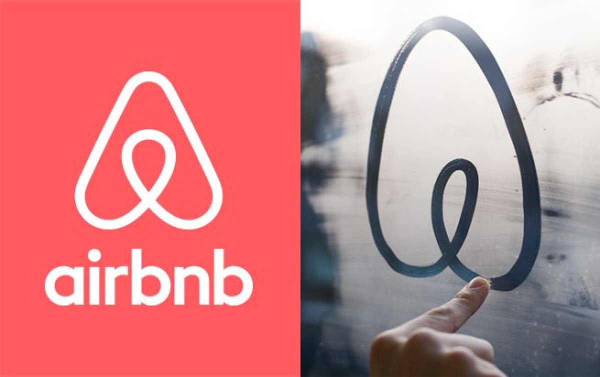
Airbnb underwent a pretty dramatic redesign in July 2014 when it ditched the lowercase "a" logo for a loopy circular thing that represents...something. It even gave the new logo a name with an unnecessary accent mark: Bélo.
Still confused? Take it away, Airbnb.
Belonging has always been a fundamental driver of humankind. So to represent that feeling, we've created a symbol for us as a community. It's an iconic mark for our windows, our doors, and our shared values. It's a symbol that, like us, can belong wherever it happens to be. It's a symbol for people who want to try a new tea they've never heard of from a village they couldn't find on the map. It's a symbol for going where the locals go—the cafe that doesn't bother with a menu, the dance club hidden down a long alleyway, the art galleries that don't show up in the guidebooks. It's a symbol for people who want to welcome into their home new experiences, new cultures, and new conversations. We're proud to introduce the Bélo: the universal symbol of belonging.
Of course, there's a video.
The explainer concludes by outlining the four things the Bélo stands for: people, places, love (lol) and, of course, Airbnb, the consummate encapsulation of all that is good in the world.
UBER
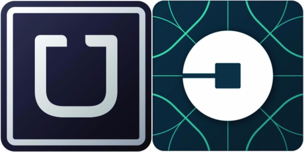
It shouldn't come as a surprise that the largest load of nonsense served alongside a rebrand could be said to belong to Uber. In February 2016, the company ditched its "U" logo for a new one based on "bits and atoms." It produced a two-and-a-half-minute video to (try to) explain its motivations. The video features kittens and brisket, and barely stops short of saying the entire history of the universe culminated with the creation of Uber.
Let's take a closer look.
"Consider...the bit, the building block of the digital world. It was invented just 70 years ago, yet, in its short life, it has changed the way we communicate, do business and live almost every aspect of our lives. For Uber, the bit represents our technology. It's complex, precise and advanced, but when it is expressed, it is effortless...and refined."
Mind blown? Well prepare to have it more blown.
If you think the bit is a big deal, consider the atom. Born 13.8 billion years ago, the atom is responsible for everything, from the BLT, to moms everywhere, to New York City. For us, the atom signifies our rapidly improving cities, the good we move from place to place, and most importantly, the people we serve.
Uber loves moms.
Until a few short years ago, atoms and bits existed in entirely different worlds. But then, something happened. At Uber, we asked, What if we brought these two worlds together? What would that look like? It looks...like this...
If atoms are everything, then how did they exist in a different world than bits? What exactly is Uber talking about here? Is it claiming responsibility for inventing digital technology?
While we ponder these questions, the video provides us with a carefully curated mixture of demographics enjoying Uber's services. There are black people and white people, old people and young people, male people and female people. Perhaps some of those female people are mothers. Makes you think.
Most of us don't think about bits or atoms much...if ever. We think about how to get from here to there, the people in our lives, the millions of tiny dramas that play out across the world each day...the human stuff. Uber ultimately succeeds because we think about the human stuff first. But the way we do it...that's our secret. We leave no bit or atom unturned to create industries that serve people...and not the other way around.
In conclusion, Uber is basically a charity. Truly inspiring. Bless you, Uber.
Uncommon Knowledge
Newsweek is committed to challenging conventional wisdom and finding connections in the search for common ground.
Newsweek is committed to challenging conventional wisdom and finding connections in the search for common ground.
About the writer
Ryan Bort is a staff writer covering culture for Newsweek. Previously, he was a freelance writer and editor, and his ... Read more
To read how Newsweek uses AI as a newsroom tool, Click here.